References

All images used have been taken by myself.

Font: Steen, K. Velocette. Retrieved May 31, 2015 from http://www.dafont.com/velocette.font

Research:

Live Science Staff. (2012). How do Electric Guitars work?. Retrieved May 30, 2015 from http://www.livescience.com/33810-electric-guitars-work-llmmp.html

Petronzio, M. (2012). How an Electric Guitar Actually Works. Retrieved May 22, 2015 from http://mashable.com/2012/12/13/electric-guitar/

Showcaine. (2014, January 15). How do Electric Guitars work? . Retrieved from https://www.youtube.com/watch?v=GCb1_-17kD0

Summary

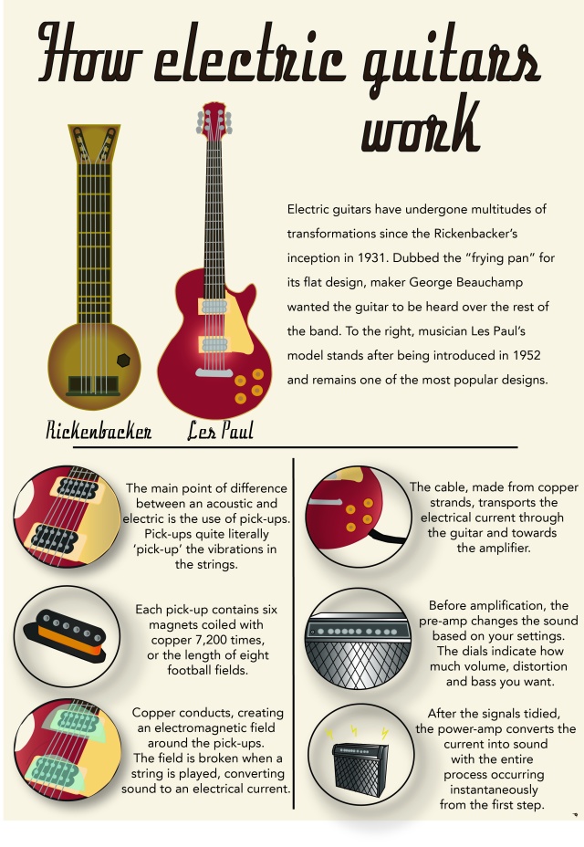
My intended communication objective was to explain the process behind the sound an electric guitar makes by condensing a complex process into simple sentences. That might sound basic but let me explain, the electric guitars sound is something we never really think about, or certainly I’ve never given much thought to and I play the guitar myself. You plug in the lead at both ends and away you go so I wanted to communicate a process we never think about.

One of the first tools we used in class was the shape tool which I used to create my background. The most significant application of this would be the background layer which allowed me to manipulate and lock my background without moving anything else around it. In moving pieces around, the grouping tool was particularly effective in adjusting the position of my circles in the second layer as well as grouping my instruments paths into one object.

The pathfinder tool was something else taught in class which had its uses in cropping out unnecessary extras. In one of my circles I used the same guitar vector as the one full sized one, so all I had to do was fit it within its position in the circle and then crop out the remaining extras.

Vectors and the pen tool allowed me to create my graphics and illustrations by tracing over the images I had taken. The Les Paul guitar and amplifier were my images but I couldn’t find any royalty free picture of the Rickenbacker. Consequently I had to make my own by using a mixture of the shape tool, creating the bottom half of the guitar and the using the pen tool in making its head and strings.

The type tool also helped in setting the tone of the infographic in keeping things simple but also pleasing on the eye. I went through a host of different fonts before deciding on the final one to use as I tried out a couple different themes for the piece. In settling on Velocette for the title, I thought it mimicked the Gibson guitar font quite well and was a compromise as I tried to create a neon-type sign which failed horribly. I had to adjust both the leading and tracking in the title, firstly to give myself more space below since there was a big gap between the lines. Secondly, the tracking between the letters was close, making my text with stroke look clunky and heavy, giving room between each of the letters really changed this to make it clear.

Colour choice was probably the hardest to figure out actually, ultimately going with a warm/natural choice in not being too abrasive. I also used gradients in an attempt to give some of my graphics dimension and depth.

Brief 2 – Top 5 Comments

Below are my top 5 comments:

Blade Broome – Progress Update

Really want to see the finished infographic of this as its already looking awesome. I do think that you will need the markings though just in response to the earlier comment, considering it’s one of the points of difference between league and rugby. You might just want to be careful with how much text you use to balance the graphic out as well but I’m sure you’ll figure it out. Keep it up!

Link: https://bladebroome.wordpress.com/2015/05/15/progress-update/

Yohanna Najoan – WORK in Progress

I think your vector art looks really cool, like how you’ve incorporated the tourist vector you had from your WIP ages ago – it’s a creative way of putting it in. A suggestion would be to maybe increase the spacing between some of your titles? It’s mostly just the second one where ‘in’ and ‘perspective’ look like they’re one word. Both of these colour schemes look good though, like you say, the green kinda reminds you of nature whilst the blue is evocative of the sky and flying to your destination.

Link: https://wordpress.com/read/post/id/86218551/148/

Mananchaya Wattanachayakul – Progress Report #2

Wow looking really good already! Your graphics have dimension and a soft tone that fits well with your overall theme. Have you tried using gradients to make your cup look more realistic? It could give a subtle lighting effect and make it more how you’d like. Looking forward to seeing your finished infographic!

Link: https://wordpress.com/read/post/id/86136379/251/

Emily Fly – I think I’m almost there.. what do you think of my progress?

This is looking very cool! I can see you’ve put some thought into the colour using a calming, healthy blue. Have you thought about perhaps making your title bigger or adjusting the stroke a tiny bit? Other than that, the extra cat makes a good addition!

Link: https://wordpress.com/read/post/id/86218870/164/

Tyler Brady – WIP FIVE

Your topic looks like a really interesting one focusing on New Zealand! I like how your colour scheme represents New Zealand’s coasts and forests and your title gives it a rugged feel to the whole thing. Have you thought about including a background colour in the inforgraphic as well? Maybe like some kind of ochre or eggshell?

Link: https://wordpress.com/read/post/id/86138128/116/

Link: https://wordpress.com/read/post/id/86218870/164/

Brief 2, Research Post #5 – Guitar infographics

I haven’t actually found very many effective infographics on exactly how an electric guitar works, most graphics just seem to point out the various parts to a guitar. However, I thought the ones I have found could be good points of reference when beginning to construct and write mine.

Regardless of how unappealing and unattractive it appears on the eyes, I think this does fulfil the criteria of an infographic. They’ve explained the basic procedure of how an electric guitar works but they’ve done so using specific terminology and diagrams, there isn’t a picture of an amp anywhere on the diagram but instead just close-up shots. This is something I need to bare in mind when writing my own to use layman terms to describe the parts.

The second one more so describes, rather than explains how a guitar works. The terminology is understandable because of the diagram dead centre but it explains it too simply and is really convoluted, repeating itself numerous times throughout. It takes three paragraphs to describe that the guitar picks up the sound, which travels through the lead and out the amplifier, most people understand this kind of knowledge already. It doesn’t go into the specifics of exactly how an electric works, the different vibrations and signals present.

This’ll be helpful when writing my own to keep it short, simple and describe in full.

Brief 2, Research Post #4 – Layout

An informative and interesting infographic will make good use of layout techniques to discover what is the most appealing.

One rule I found was the ‘show don’t tell’ meaning that if I can use visual aids to show data, then do it. Good layout placement will combine graphic and text, allowing the viewer to grasp what’s occurring in a short space of time. For my own infographic, I won’t need to use data as it’s a ‘how to’ so the graphics will have to simple, clean and effective to support my use of text. One website suggested turning off text layers now and then to see if the infographic still makes sense, which could be helpful in mine to make sure my ‘how to’ diagrams have a flow and narrative structure.

Another layout tip I discovered was the use of whitespace whic can create harmony between text and graphic. Too little can make it look busy whilst too much can leave it with a sense of being incomplete.

whitespace-matters

Using the above image as an example, the difference is instantly recognisable in how whitespace has been used in layout design. It’s kept text in shorter lines to make it appear like less of a read and made good use of the available space in doing do, whilst the one on the right however has left large chunks of space around the work, giving the incomplete feel I mentioned before. This is noticeable in the bottom layer by using a grid-like pattern, the graphics become like bullet points to combine with text so although there isn’t data to show the graphic complements the text rather than dominating or being unnecessarily used. It still has whitespace between each point but its done in such a way where it doesn’t leaving it feeling incomplete like the one on the right. On the right side is a large chunk of space which could’ve even been minimised if text had been aligned in the centre rather than the right. It really shows the impact layout and whitespace can make in treating engaging infographics.

Good layout should also make use of an engaging ‘hook’, which is typically found in the centre or end of the piece. In my own infographic my hook, which will be a guitar will most likely at the end of the piece in the top half of the infographic. As our eyes read left to right, I will also place the now/then graphic in top, left, maximising potential engagement.

The infographic above makes use of a good hook, using the grumpy cat meme and Justin Bieber who are pop culture icons as hooks to draw the viewer into the infographic. However, I would argue that the image itself is far too busy with a lot of text and minimal images.

Sources:

http://www.smashingmagazine.com/2011/10/14/the-dos-and-donts-of-infographic-design/

http://piktochart.com/layout-cheat-sheet-making-the-best-out-of-visual-arrangement/

http://www.meltwater.com/wp-content/uploads/2014/03/sxsw2014-1000x2000_1-1

Concept Thumbnails (Brief 2)

Below are some of the finest thumbnails to grace wordpress. It’s a really a toss up between 1 and 2, I don’t think a horizontal layout really fits with what I have in mind as the guitar is a vertical object – something I think will leave too much free space around the infographic.

I like the large picture of the guitar on 1, simply because it would be a good reference point for someone to use if they had absolutely no knowledge of guitars or had barely even looked at one. I could even possibly label the parts if I had to. However, I kind of like the layout of 2 more, it’s more pleasing to look at. Plus I was thinking of placing tiny pictures into the circles of the close-up parts of the guitar, so even though the image on the first layer isn’t that big, the close-up image should suffice to explain without having to label.

1

1

2

2

3

3

4

4